I recently received a request to incorporate a static object above a grid, complete with instructions for users. As our applications continue to grow in complexity, ensuring that users have clear and concise instructions becomes increasingly important. Thankfully, achieving this is remarkably straightforward with a little help from CSS.
The first step in this process involves creating our instructions page item. We'll place a Static Content item at the top of the page body.
Now, let's delve into the setup of this item. To make our instructions stand out, we'll enclose the HTML Code within <b></b> tags, rendering the text bold and easily noticeable.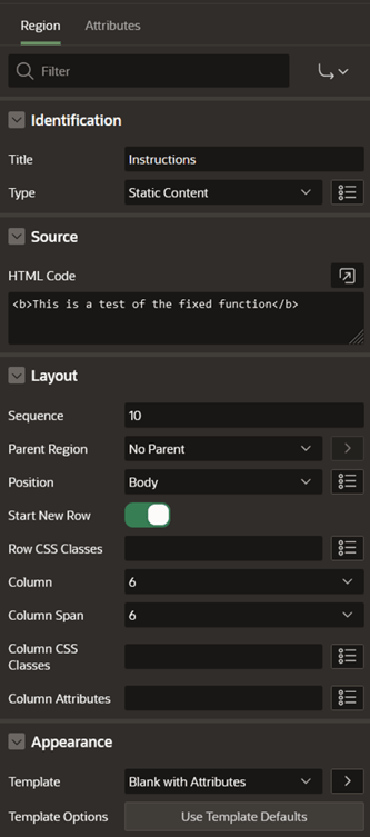
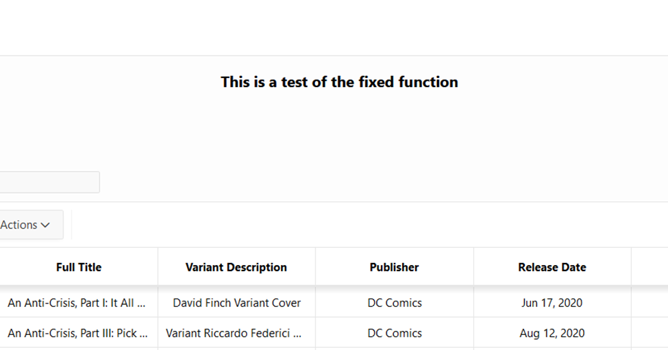
At this point, we have our item on the page, but it lacks the crucial attribute of staying in place. To remedy this, we need to introduce some CSS magic.
To begin, we should add CSS Classes to modify the item's appearance.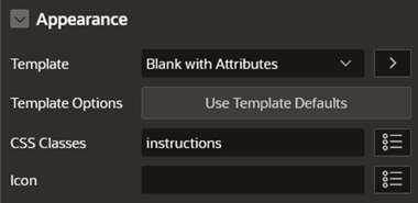
The first order of business is to establish the item's position.
By setting the position, we ensure that the item remains fixed on the page. However, there's a slight issue – this item might end up positioned behind other elements on the page as you scroll down. To prevent this, we need to adjust the z-index, ensuring that our item stays above all other page elements. Typically, APEX pages top out at a z-index of 460. To keep our item in place, we'll set the z-index to 461.

Next, we can add a few optional CSS Class properties to further customize our static field. 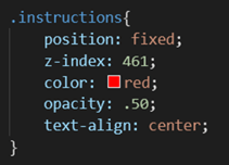
You have the flexibility to change the text color by altering the 'color' property and control the opacity with values ranging from 0 (completely transparent) to 1 (fully opaque).
With all these settings in place, our item will confidently rest above all other page elements, remaining steadfastly anchored right where you've positioned it.
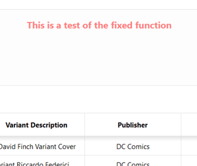
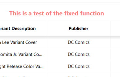
In an age where websites are growing increasingly complex, CSS offers a powerful solution for enhancing user experience and ensuring clarity. By applying these techniques, you can elevate your web pages, providing clear instructions that guide users seamlessly through their interactions. Harness the potential of CSS to create a user-friendly digital environment that leaves a lasting positive impression on your visitors.
.png)
SUBMIT YOUR COMMENT